
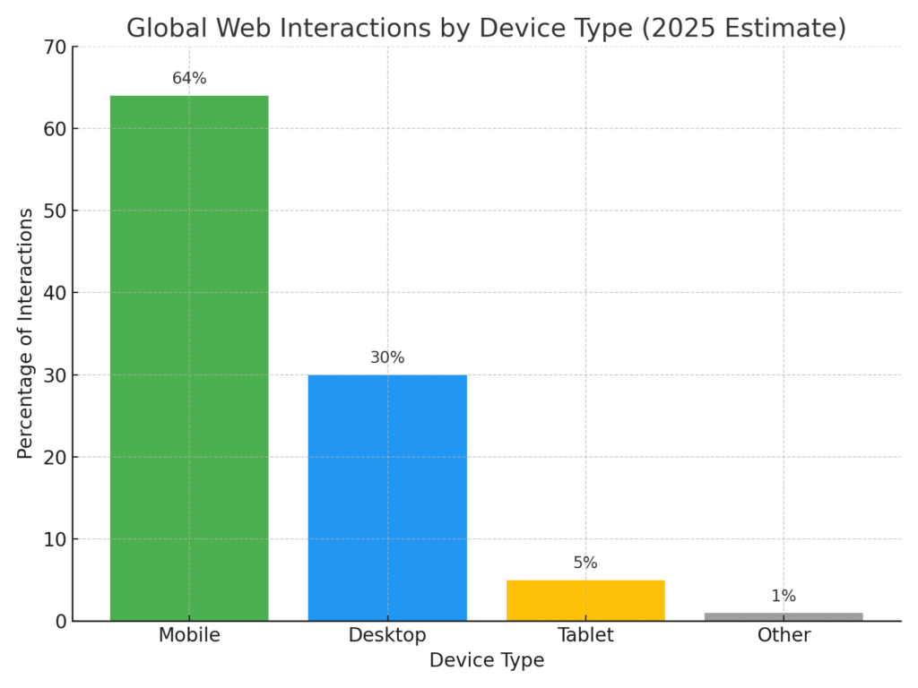
The majority of web interactions happen on mobile devices. In fact, mobile now accounts for roughly 64% of global web traffic. This makes web design more critical than ever: a site must look and work great on every screen. However, designing responsively brings its own hurdles. Business owners face issues like device fragmentation, performance bottlenecks, content prioritization, complex testing, and keeping a consistent brand experience. Each of these challenges can erode user satisfaction and hurt conversions if not addressed properly. In this post Dr. Omwenga explains these key challenges in detail and provides proven strategies and tools to tackle them head on.
The following chart summarizes global web interactions by device type as of 2025.
Common Challenges in Responsive Web Design
1. Device Fragmentation
Users today access websites on devices of all shapes and sizes. Smartphones, tablets, laptops, 4K monitors and even smart TVs all have different resolutions and aspect ratios. In practice this means dozens (or hundreds) of breakpoints to consider. For example, testing a site on an iPhone 14 versus a foldable phone versus an Android tablet can reveal very different layout issues. With around 64% of web traffic coming from mobile devices, failing to accommodate this diversity means losing most of your audience.
Device fragmentation forces designers to create fluid, adaptive layouts rather than fixed-width pages. Without careful planning, important content can end up off-screen, and parts of the site may look “shabby and disoriented” on some screens.
2. Performance Optimization
Responsive sites often load on slower networks, which can amplify performance problems. Large images, videos or scripts that look fine on desktop can dramatically slow down a page on mobile.
As one expert warns, if a site “takes time to load, your user will exit the website”. Google research shows that even a 2–3 second delay can increase bounce likelihood by about 32%. In practice, many sites today average 8+ seconds to load on mobile – far above the 2–3 second target.
When pages don’t render quickly, potential customers give up and go elsewhere. Slow performance is therefore a major challenge in responsive web design: it directly hurts conversion rates and SEO.
3. Content Prioritization and Hierarchy
Mobile screens are small real estates. What works on a multi-column desktop may feel cramped on a smartphone. As Act-On notes, “when the real estate of a desktop page shrinks to hand-held size, content gets jumbled” unless it is prioritized. If designers don’t deliberately assign a content hierarchy, the most important messages can be pushed below the fold on mobile. This means that without a strategy, vital product info or calls-to-action may end up at the bottom of the page. The challenge is to distill content so that critical information and navigation appear first on every device, while secondary elements are streamlined or hidden.
4. Testing Complexity
Ensuring a site works across all browsers and devices is a daunting task. There are hundreds of smartphone models, various tablets, and multiple operating system versions – not to mention desktop browsers (Chrome, Safari, Edge, etc.). Manually checking each combination is virtually impossible. This complexity means hidden bugs often slip into production. For example, older browsers or less common phones may not support newer CSS features or flexbox, breaking layouts.
As BrowserStack explains, large-scale testing is essential: its platform lets QA teams test on “multiple devices at the same time simulating real user conditions. Without such tools, teams can spend weeks troubleshooting device-specific issues. In short, cross-browser and cross-device testing adds significant overhead to development.
5. Brand Consistency
A responsive site must feel like a unified experience of your brand. But with many screen-specific tweaks, inconsistent styling can creep in. Even subtle differences – a button color here, a font there – can confuse customers and erode trust. Inconsistent design elements, like mismatched fonts, inconsistent layout, and different button styles can confuse users. For a business, this inconsistency can weaken branding and frustrate repeat visitors. Maintaining a cohesive look-and-feel across breakpoints is a key challenge of responsive design. It requires disciplined use of a single style guide or design system so that elements like logos, colors and components behave predictably everywhere.
Solutions and Strategies
1. Mobile-First Design
Begin by designing for the smallest screens and scale up. With over 60% of web traffic on mobile, a mobile-first approach forces you to focus on core functionality and content from the start. Google explicitly recommends responsive design as the easiest way to stay mobile-friendly. By sketching the mobile layout first, you ensure that essential elements are prioritized. Then enhance the layout for larger devices. This strategy streamlines design decisions and avoids the “bloat” of trying to retrofit a complex desktop design to a phone.
2. Flexible Grids & Media Queries
Use fluid, percentage-based grids and CSS media queries to adapt layouts to any screen size. Modern CSS tools like CSS Grid and Flexbox make it much easier to create flexible, multi-column layouts that collapse gracefully. For example, Bootstrap’s grid is “mobile-first” and fully responsive: it “scales up to 12 columns as the device or viewport size increases”. You can set breakpoints at key widths (e.g. 480px, 768px, 1024px) so that the page layout reflows rather than simply shrinking. As BrowserStack explains, well-placed breakpoints in media queries “solve the device fragmentation issue” by ensuring content reorients smoothly across screen sizes. The result is a single codebase that fluidly adapts, rather than many fixed-size designs.
3. Performance Optimization Tools
Speed is critical, so build and test for performance from the start. Leverage tools like Google Lighthouse (built into Chrome DevTools) to audit page speed and render-blocking issues. Set performance budgets (e.g. limit total page weight) and optimize assets. For instance, serve images in modern formats (WebP/AVIF) and use responsive <img> with srcset so each device downloads the appropriately sized image. Remove unused CSS/JS and lazy-load below-the-fold content. Monitoring tools can flag when load times creep up. In practice, many teams use automated testing (e.g. using SpeedLab, Lighthouse CLI or PageSpeed Insights) in their build pipeline to catch regressions.
4. Advanced Testing Platforms.
Don’t rely solely on emulators; test on real devices and browsers. Services like BrowserStack or LambdaTest let you run your site on hundreds of real smartphones, tablets and desktops in the cloud. This ensures you catch layout bugs and JavaScript issues across operating systems and browsers without maintaining your own device lab. Continuous integration pipelines can run automated Selenium tests on multiple viewports. Pair this with browser developer tools’ device emulation for quick checks. By automating cross-browser testing, you drastically reduce manual QA effort and make thorough testing feasible.
5. Content Hierarchy Planning
Collaborate closely between designers, content strategists, and marketers. Identify your most important messages and features before laying out the design. Create a content hierarchy: Tier 1 content (key value propositions, CTAs) must appear prominently on mobile, while Tier 2 content can follow or be toggled via accordion menus. In practice, marketers often “distill” content into concise chunks, as responsive design demands less scrolling and simpler flows. Consider techniques like progressive disclosure: reveal more detail only as needed. The Act-On marketing firm emphasizes that prioritizing content is essential to prevent important info from dropping off the top of the page.
6. Unified Design Systems
Maintain a single source of truth for styles and components. Define a design system or style guide that includes typography, colors, iconography, and UI components at all breakpoints. This prevents the button becomes wrong color problem. As Smashing Magazine notes, design systems ensure alignment, consistency across brand or project, and reusability. Using a framework like Bootstrap, Tailwind CSS, or a custom component library enforces consistency: for example, all pages use the same grid and spacing tokens. Regularly review changes on multiple devices to catch any drift. A disciplined design system approach means that you solve the consistency challenge once, at a system level, rather than piecemeal on each page.
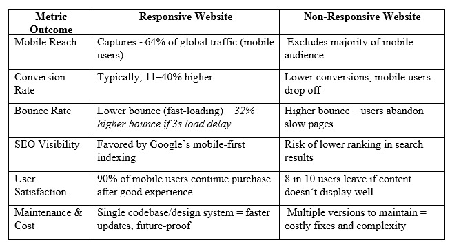
Responsive vs. Non-Responsive Website
The table below provides comparisons between responsive and non-responsive websites:
Key Insights for Business Owners
Investing in responsive web design delivers concrete business benefits.
Customer Satisfaction: Sites that adapt smoothly to any device keep users happy and engaged. Studies show 90% of mobile shoppers will continue buying if they get a good mobile experience, whereas poorly-designed mobile sites drive away about 80% of visitors.
SEO Advantage: Google now primarily indexes and ranks the mobile version of pages. Responsive sites get better SEO outcomes – Google even recommends responsive design – while non-responsive sites risk lower rankings and lost traffic.
Higher Conversions: Responsive design has a direct ROI. Research finds that responsive sites typically convert 11–40% more effectively than non-responsive ones. More conversions mean more sales with the same traffic.
Scalability and Cost Savings: Over time, maintaining one responsive site is far cheaper than juggling separate mobile and desktop versions. A unified codebase and design system (as noted above) reduces development time and future-proofs the site for new devices, saving money in the long run.
By contrast, a non-responsive (or poorly responsive) site can erode your bottom line: higher bounce rates, lost sales, and a poor brand impression. Use the table above to compare key outcomes: note how responsive design dramatically improves engagement, SEO, and conversions.
Conclusion
Addressing responsive design challenges is not optional in today’s market – it’s essential for growth. Overcoming device fragmentation and performance issues, and establishing clear content priorities and design systems, leads to a website that delights customers on any device. The payoff is a significant competitive edge: higher SEO rankings, better conversion rates, and a stronger brand presence online.
Ready to optimize your site’s responsiveness? Our team can help transform your website into a fast, responsive platform that drives customer satisfaction and business growth.
Our contact: nearbyitems.com
Email: dr.omwenga.services@gmail.com